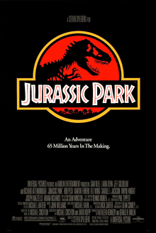
 The two posters here are different as the one on the top is from the recent movie that got released this year, whereas the one at the bottom is from 1993, so there is 22 year difference between the two films.
The layout is pretty similar as the logo is the dominant image of the t-rex and the title of the film is in pretty similar font and size, with the title underneath the t-rex, it is a conventional thing for them to do with their layout.
However, the difference is the colours in the two photos. As in the 1993 one, the colours are red, yellow quite bright colours and the colour red can symbolize danger, blood, which would maybe mean that the dinosaurs are a threat to humanity, by maybe killing the humans. The 2015 version has more of a different version as it is quite a dark, grayish and I think it symbolizes a dawn of the dinosaurs and the 1993 print is almost the rise of the dinosaurs. By having such dark colours and making the print look quite ancient suggests that maybe the dinosaurs aren't as portrayed as they once were, vicious and terrifying. Another difference is the background in the two prints, which can show the progression of technology as the 2015 one looks much more smoother and much better, however for 1993, that maybe was smooth so standards have changed the past 22 years as the development of technology has kind of made the consumer expect these changes as technology gets better.


